ShopDreamUp AI ArtDreamUp

Deviation Actions


Suggested Deviants


Suggested Collections


You Might Like…


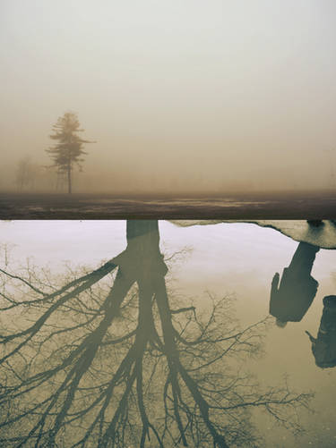
Image size
894x660px 108.26 KB
Make
SONY
Model
DSLR-A330
Shutter Speed
1/100 second
Aperture
F/7.1
Focal Length
20 mm
ISO Speed
100
Date Taken
Feb 28, 2011, 8:14:50 AM
© 2011 - 2024 Archangelical
Comments12
Join the community to add your comment. Already a deviant? Log In
... good idea to place the shadows.
maybe I'm wrong, but
with regard to the shadow of the winged heart
which suggests that the light comes from top right ...
so the shadows on her right side and on above her head
look unrealistic to my eyes.
please don't take it amiss, it's just my humble opinion,
nice concept and tones anyway!
maybe I'm wrong, but
with regard to the shadow of the winged heart
which suggests that the light comes from top right ...
so the shadows on her right side and on above her head
look unrealistic to my eyes.
please don't take it amiss, it's just my humble opinion,
nice concept and tones anyway!